
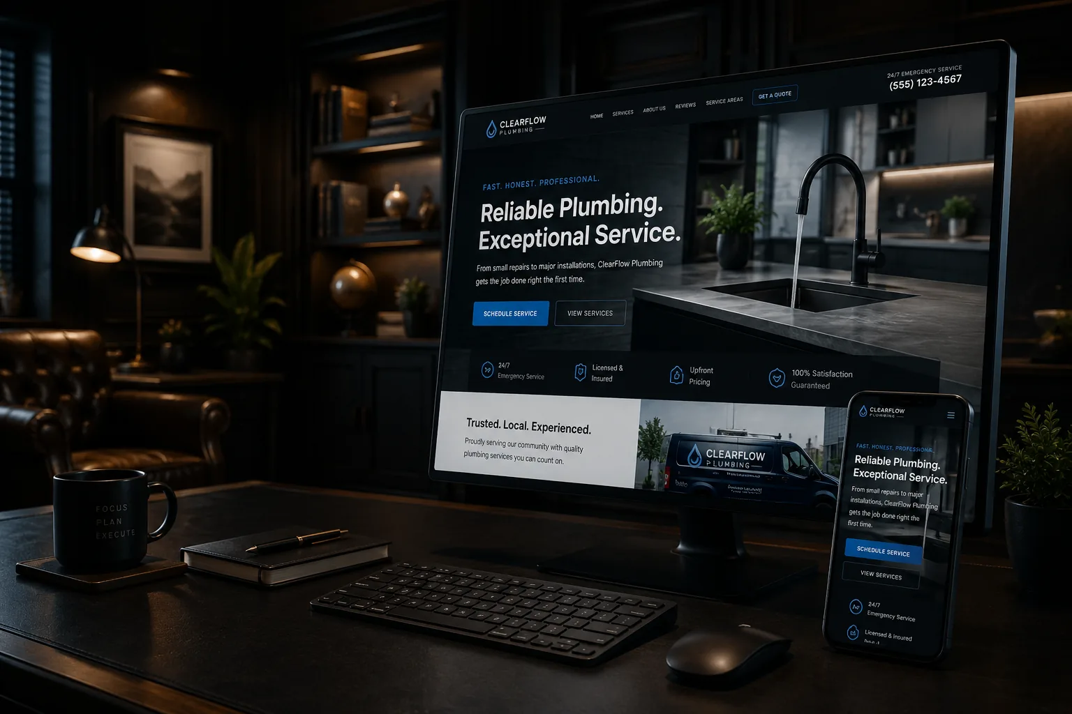
Yes, you can do a useful first accessibility check without knowing how to code. You won't be proving that the whole site meets every requirement, but you can find the barriers most likely to stop someone from reading a service page, opening the menu, or requesting an estimate. Start with the same jobs a customer comes to the site to do.
Start with the tasks people need to complete
Accessibility gets complicated when it begins as a list of rules. It makes more sense when you begin with a person trying to get something done. On a plumber's website, that may be finding the emergency number. On a landscaper's site, it may be comparing services and asking for an estimate. On a countertop company's site, it may be viewing material choices and booking a showroom visit.
Pick three important tasks and write them down. Then try each task on a phone and a computer. If a menu, photo gallery, form, or booking tool blocks the task, you've found something worth fixing even before a formal audit begins.
The W3C recommends WCAG 2.2 as the current accessibility standard. It covers much more than color contrast. It also addresses keyboard use, visible focus, headings, labels, error messages, target size, consistent help, and accessible sign-in steps. You don't need to memorize those terms to notice when a customer can't use the page.
Five checks you can do without a developer
These checks won't replace testing by an accessibility professional or people who use assistive technology. They will give you a practical starting point.
- 1.Use only the keyboard. Press Tab to move forward, Shift and Tab to move back, Enter to activate a link, and Space to use many buttons. You should always be able to see which item is selected. Make sure you can open and close the menu, reach the phone number, and complete the contact form without a mouse.
- 2.Enlarge the page to 200 percent. The words should become easier to read without disappearing, overlapping, or forcing you to scroll sideways for normal page content. Do this on a service page and on any page with a form or pricing information.
- 3.Read the page as an outline. The main heading should say what the page is about. The next headings should describe the sections underneath them. A heading such as “Our Solutions” is less useful than “Furnace Repair and Replacement” when that is what the section actually covers.
- 4.Look at images and video with the sound off. Job photos that communicate useful information need text alternatives that explain their purpose. Decorative images should stay out of the way of a screen reader. Videos that carry spoken information need accurate captions.
- 5.Make the form fail on purpose. Leave a required field blank, enter a bad email address, and submit it. The page should identify the problem clearly, keep the information already entered, and let you correct the error without hunting for it.
An estimate request that looks fine but doesn't work
Imagine a homeowner in Bow looking for an electrician after work. She enlarges the text on her phone and tabs through the estimate form using a connected keyboard because precise tapping is difficult. The form has pale gray labels that disappear when she starts typing. When she misses the required project-date field, the page adds a red outline but no written message. Then it clears everything she entered.
Nothing in that example requires the owner to understand screen-reader software or website code. The failure is plain: the customer wasn't told what went wrong and couldn't finish the request. A sensible repair would add permanent field labels, a specific written error, a clear focus indicator, and error handling that preserves the rest of the form.
The related guide on why contact forms lose leads follows the entire path from form completion through delivery and follow-up.
What a scanner can and can't tell you
Automated accessibility tools are useful. They can flag certain missing image descriptions, unlabeled form controls, heading problems, and some color-contrast failures. They can't tell you that every image description makes sense, that the menu works in a logical order, or that a person can recover from a confusing error.
Be careful with anyone who runs one scan, gives the site a score, and calls the job finished. Be equally careful with a widget that promises instant compliance. A layer added on top of the site doesn't repair an unlabeled form, a broken keyboard menu, or a document that can't be read. Real improvement comes from fixing the underlying page and checking it again after updates.
This isn't legal advice, and an owner-run check isn't a legal compliance opinion. If your organization has specific contractual or legal obligations, get qualified guidance for those obligations. The practical work still starts with removing barriers from the pages people actually use.
Turn the findings into a repair plan
Don't hand your web person a pile of screenshots with no order. Rank each problem by what it stops a customer from doing. A menu that can't be opened, a phone link with no useful name, or an estimate form that can't be submitted comes before a minor spacing issue on an old blog post.
For each repair, record the affected page, the task that failed, how you tested it, and what a successful retest looks like. Then make accessibility part of ongoing website maintenance, especially after a new form, booking tool, theme, or plugin is added.
A useful first audit should leave you with fewer blocked tasks and a clear next step, not a mysterious score. Keep the improvements in place through ongoing website maintenance, or ask TechDad Technology for another set of eyes during a free strategy call.
Sources
- W3C: Web Content Accessibility Guidelines (WCAG) 2.2 - https://www.w3.org/TR/WCAG22/
- W3C WAI: What's New in WCAG 2.2 - https://www.w3.org/WAI/standards-guidelines/wcag/new-in-22/
- W3C WAI: How to Meet WCAG - https://www.w3.org/WAI/WCAG22/quickref/
- Google Search Central: Mobile-first indexing best practices - https://developers.google.com/search/docs/crawling-indexing/mobile/mobile-sites-mobile-first-indexing