
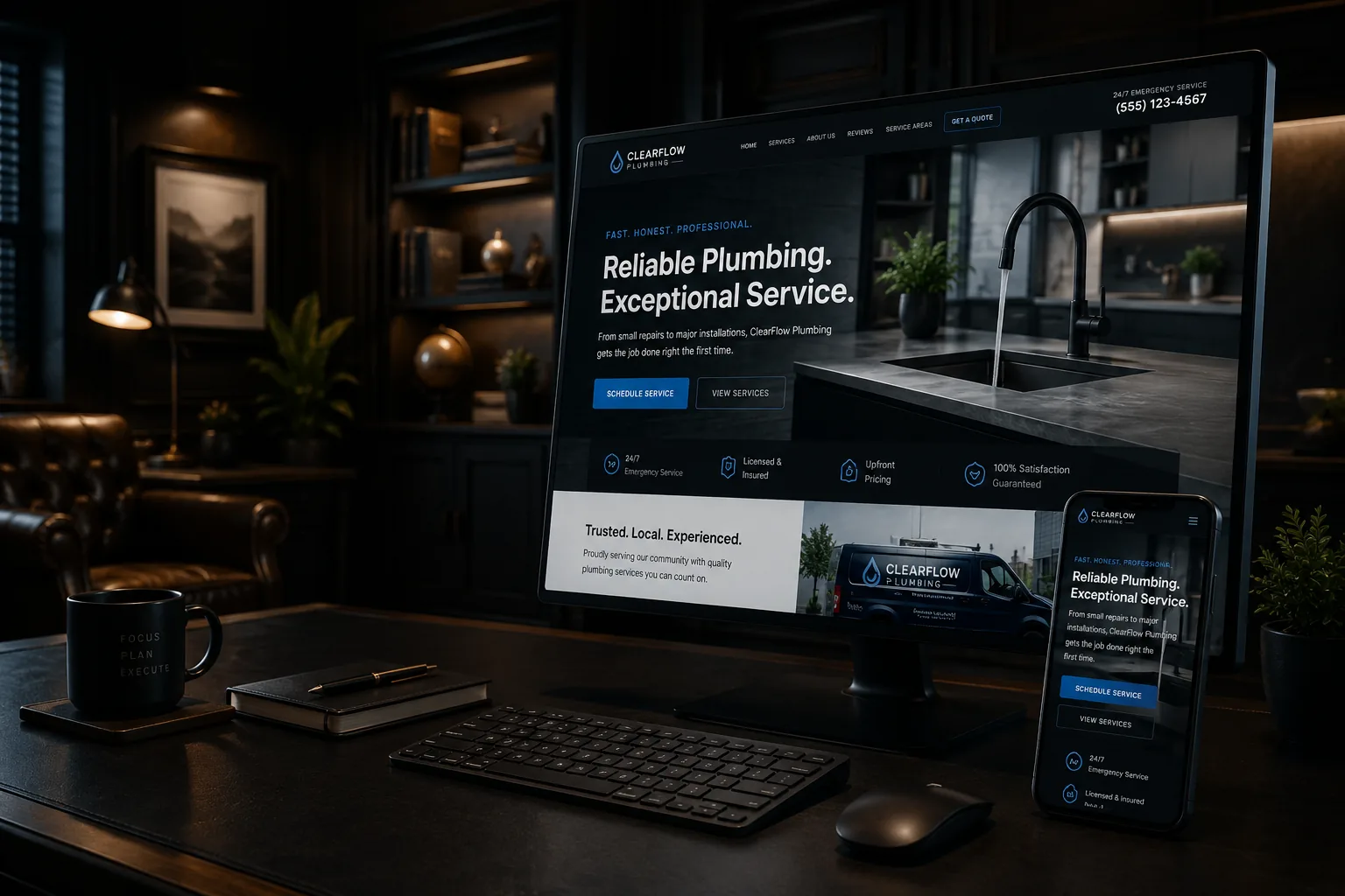
A contractor website does not need to be fancy. It does not need spinning graphics, clever animations, or trendy design language that sounds like it came from a marketing textbook. Most homeowners and business owners looking for a contractor are not impressed by that stuff anyway.
They want to know a few basic things: Can you do the work they need? Do you work in their area? Can they trust you? Have you done this type of job before? How do they contact you? That is what matters.
If you are a contractor thinking about hiring someone to build or redesign your website, it is easy to get distracted by things that look impressive but do not actually help your business. A good contractor website should be clean, clear, fast, mobile-friendly, and built around helping people take the next step. Before you spend money on website design, here is what actually matters.
Your Website Should Make It Obvious What You Do
This sounds simple, but a lot of contractor websites miss it. When someone lands on your website, they should know what kind of work you do within a few seconds. They should not have to scroll halfway down the page or click around to figure it out.
The top of your homepage should answer three questions: What do you do? Who do you help? Where do you work? A simple sentence like this can do more than a clever slogan: "Residential and commercial painting services in Concord, NH and surrounding towns." That is not flashy, but it works.
People are busy. They are usually searching because they need help with something specific. Your website should not make them guess whether you are the right company.
Clear Beats Clever Every Time
Contractor websites should be easy to understand. Some websites try too hard to sound polished. They use vague phrases like "Elevated solutions for modern living" or "Your trusted partner for property transformation." That might sound nice, but it does not tell people what you actually do.
Clear language works better. Instead of trying to sound impressive, explain your services in plain English. Tell people what you do, what problems you solve, and how they can get started. For example: "We replace old decks, build new outdoor living spaces, and repair unsafe stairs and railings." A homeowner with an old deck knows they are in the right place.
Good website design is not just about the layout. It is also about the words. If the website looks nice but the message is vague, it will not do its job.
Your Services Need More Than a Bullet List
One of the biggest website mistakes contractors make is putting every service on one short page. A page that says "Our Services" with a list of ten things may not be enough. If someone is searching for bathroom remodeling, they want to see that you actually do bathroom remodeling. If they need a panel upgrade, they want to know you handle that type of electrical work.
Each main service should have its own page when possible. A good service page should include what the service is, who it is for, common problems you solve, what your process looks like, photos if available, areas you serve, reviews or trust signals, and a clear way to contact you.
This helps people understand your work. It also helps Google understand what your business should show up for.
Your Website Should Show Where You Work
Contractors need local customers. That means your website should clearly explain your service area. Do you serve Concord? Southern New Hampshire? The Lakes Region? Manchester, Nashua, Bedford, Hooksett, Bow, or nearby towns? Do not make people wonder.
Your service area should be mentioned on your homepage, contact page, and service pages when it makes sense. If your business serves several towns or regions, service area pages may also help. But service area pages need to be useful — a page for a town should explain the work you provide there, the types of customers you help, and why someone in that location should contact you.
Reviews Should Be Easy to Find
Hiring a contractor can feel risky for customers. They want to know you show up, communicate, do good work, and treat people right. Reviews help with that. Your website should include customer reviews in places where people are making decisions — your homepage, service pages, about page, or contact page.
Do not hide all your reviews on one page that nobody visits. A few strong reviews placed throughout the website can make a big difference. If you have strong Google reviews, use them. If you have project-specific testimonials, place them near the matching service page when possible. A deck-building review belongs on a deck page. A bathroom remodel review belongs on a bathroom remodeling page.
Mobile Design Is Not Optional
Most people will view your website on a phone. That means mobile design is not something to check after the website is finished — it should be part of the plan from the beginning. Think about how a customer actually uses your site. They may be standing in their driveway looking for a sealcoating company. They may be in a basement with a plumbing issue. They may be on the couch at night looking for someone to remodel a bathroom.
- Easy-to-read text
- Simple navigation
- Clickable phone numbers
- Buttons that are easy to tap
- Fast-loading pages
- Photos that fit the screen
- Contact forms that are not annoying to use
If your website is hard to use on a phone, you are probably losing leads.
Your Phone Number Should Not Be Hidden
For contractors, the phone number matters. Some people like forms. Some people like email. But a lot of customers still want to call, especially if the job feels urgent or they have a quick question. Your phone number should be near the top of the website, in the mobile menu, on the contact page, and near calls to action. On mobile, it should be clickable so someone can tap once and call.
Do not make people hunt for it. Do not only put it in the footer. If calls matter to your business, your website should be built for calls.
Contact Forms Should Be Simple
A contact form should make life easier, not harder. Some websites ask too much upfront and scare people away. For most contractors, a simple form is enough to start: name, phone number, email, town, service needed, and a short message. You can ask more questions later.
Also, make sure the form actually works. Test it regularly. A broken form can quietly cost you leads for weeks or months if nobody notices. The form should also tell people what happens next — a simple confirmation message builds confidence.
Speed Matters More Than Fancy Effects
A slow website is a problem. People do not want to wait for a contractor website to load. Large videos, heavy animations, oversized images, and too many plugins can make a site slower. Those things might look impressive in a design preview, but they can hurt the actual user experience.
For a contractor website, speed does not need to be complicated. The goal is simple: people should be able to open your site, understand your business, and contact you quickly. A slow website creates friction before the customer even gets to know you.
What Good Contractor Website Design Looks Like
A good contractor website does not try to win design awards. It tries to win customers. That means every decision — from the layout to the wording to the photos — should make it easier for a real local customer to understand what you do and reach out.
If you are thinking about spending money on a new contractor website or redesign, focus on what actually matters: clear services, local visibility, trust, mobile performance, and easy contact. Those are the things that turn website visitors into phone calls and quote requests.