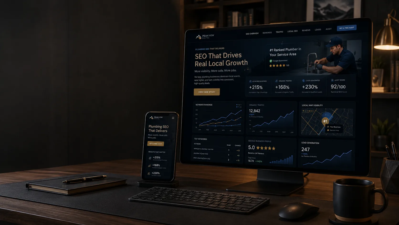
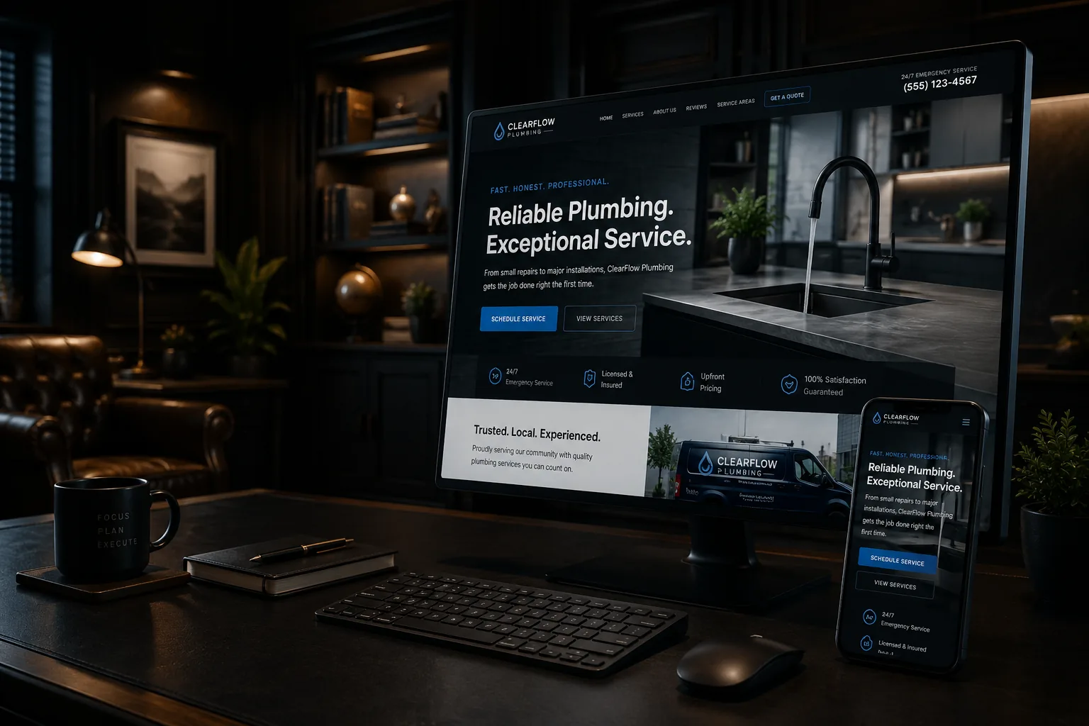
A polished website can still produce very few calls. That does not automatically mean the business needs more traffic or a complete redesign. It usually means the site is failing somewhere between the visitor's question and the next step.
A useful conversion audit asks four things in order: Are the right people arriving? Do they immediately understand the offer? Do they find enough evidence to trust it? Can they act without friction? Design supports those jobs, but visual style cannot replace them.
Start with visitor intent, not the homepage
Someone who searches for emergency plumbing has a different task from someone planning a kitchen remodel. The first person wants availability and a phone number. The second wants scope, project examples, process, and a way to start a considered conversation. If both land on the same generic page, neither path may work well.
Review Search Console queries, landing pages, call notes, and form submissions. If people arrive for services you do not offer or locations you do not serve, conversion work alone will not fix the mismatch. If qualified visitors arrive but do not act, examine the page.
The opening message may be too vague
A headline such as Quality You Can Trust sounds positive but leaves the visitor guessing. A stronger opening identifies the service, customer, location, and useful difference. For example: Residential panel upgrades and electrical troubleshooting for homeowners in Concord and nearby towns.
The first screen should not contain every credential. It should answer Am I in the right place? and present an appropriate next step. Put company history and detail lower on the page, where they can support the decision.
The site may ask for trust without showing evidence
Claims such as experienced, reliable, and professional are not evidence. Trust grows from current project photos, specific service explanations, an understandable process, real review context, accurate licensing or insurance information where relevant, and clear expectations about response and scheduling.
For example, a Lakes Region property owner evaluating a dock contractor may care about material choices, permitting responsibilities, seasonal timing, and examples on similar shorelines. A gallery without captions looks impressive but answers none of those questions.
The call to action may not match the commitment
Book Now may be too aggressive for a large project. Learn More may be too weak for someone ready to call. Use actions that describe what happens: Request a Project Conversation, Check Service Availability, Call for Emergency Service, or Ask About Website Support.
Repeat the primary action at natural decision points and provide a reasonable alternative. Some visitors prefer to call; others need a short form. Do not present six competing buttons with equal visual weight.
Mobile friction quietly loses inquiries
Google recommends responsive design and evaluates mobile page content through mobile-first indexing. More importantly, real customers use phones in trucks, basements, driveways, and areas with inconsistent coverage. Test with the conditions they face.
- Can a thumb reach and tap the phone button?
- Is the main text readable without zooming?
- Does the navigation reveal services and contact options quickly?
- Does the form use the correct input types and avoid unnecessary fields?
- Do popups or chat widgets cover content or controls?
- Can a keyboard user see focus and complete the same task?
Speed problems may be selective
A fast homepage does not prove that every landing page is fast. A gallery, booking widget, tracking script, or oversized hero image may slow the exact page used in a campaign. Core Web Vitals measure loading, interactivity, and visual stability, but Google also cautions that good scores do not guarantee rankings. Treat performance as customer experience, not a trophy.
Check field data where available and test key pages on mobile. Fix the largest customer-facing delays first. A perfect laboratory score is rarely the best use of a small-business budget if messaging or forms are broken.
Forms can fail technically and operationally
A form may appear to submit while email delivery fails, spam filtering hides the message, or no one owns the response. Test from outside the business network. Confirm the visitor sees a useful success message, the lead reaches the correct system, and someone follows up within the stated expectation.
Ask only for information that helps the next conversation. A name, contact method, service, location, and short project description may be enough. Sensitive or detailed data should not be collected merely because a form builder makes it easy.
Service-area clarity filters and converts
A statewide claim may be technically true but unhelpful. Explain the practical territory and any limits. A Concord-based company might serve central and southern New Hampshire routinely but handle Vermont or Maine projects selectively. Clear coverage reduces poor-fit calls and reassures people near the edges.
Tracking should answer business questions
Page views do not tell you whether the website is working. Track completed forms, click-to-call actions, booked consultations, and other meaningful events. Then compare them with qualified inquiries and actual sales records. Respect privacy and avoid collecting data you do not need.
Use a baseline before making major changes. If a clearer call to action improves form completions but lead quality falls, the site may be attracting the wrong intent. Conversion rate without qualification can mislead.
What to do next
- 1.Choose the three landing pages most likely to produce a valuable inquiry.
- 2.For each page, write the visitor's likely question, proof needed, and appropriate next action.
- 3.Test the complete mobile path, including the thank-you message and internal lead delivery.
- 4.Review performance, accessibility basics, and service-area clarity.
- 5.Measure qualified calls and forms for at least one normal business cycle before judging the change.
Conversion quality matters as much as volume
More form submissions are not automatically better. A contractor can double inquiries by making a form vague and promising instant estimates, then spend hours filtering projects outside the territory, budget, or service scope. A useful conversion path attracts appropriate customers and gives others a respectful way to understand that the fit is wrong.
Define a qualified inquiry before changing the page. It might require the correct service, a realistic location, an appropriate project type, and a reachable contact. Track why leads are disqualified. Patterns may reveal that the page is unclear, an ad targets the wrong intent, or the service-area claim is too broad.
Make controlled changes when possible. Revise one headline or form, record the date, and compare a normal business period. Large seasonal swings and small sample sizes can make quick conclusions unreliable. Combine data with call notes and customer conversations; numbers show where to look, while real inquiries explain why.
Fix the path before replacing the site
Some websites need a rebuild. Many need sharper messaging, better proof, fewer obstacles, and reliable measurement. TechDad Technology can review the full path and identify whether the problem is traffic quality, content, usability, technology, or follow-up — without assuming that a new visual design is the answer.