
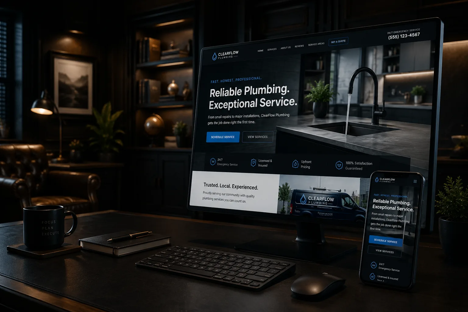
Build your website menu around what customers are trying to find: the right service, proof that you can do the work, where you work, and how to contact you. Your internal departments and company language may make sense to your team, but they shouldn't make a visitor guess.
Start with the reason someone came to the site
A customer usually arrives with a problem, a project, or a deadline. The homeowner doesn't think, “I need the Residential Solutions division.” They think, “My breaker keeps tripping,” “I need a new roof,” or “Can this company install a quartz countertop before Thanksgiving?”
Write down the questions your team hears on calls and estimates. Group them into a few customer tasks. For many New Hampshire service companies, the main paths are services, project examples, service area, about or qualifications, and contact. Your exact menu may differ, but every label should help a visitor predict what appears after the click.
Use labels customers would actually say
Clear beats clever. “Services” tells a visitor more than “Solutions.” “Projects” or “Our Work” is easier to understand than “Discover.” If you have several trades or service lines, name them. Plumbing, heating, drain cleaning, and water treatment are more useful than a single menu item called “Capabilities.”
A short menu isn't automatically a good menu. Five vague labels can be harder to use than seven specific ones. The right number is the smallest set that still lets customers recognize where to go. Keep utility pages such as privacy information and employment details in the footer unless they are a frequent reason people visit.
How a countertop company can shorten the path
Consider an illustrative countertop company serving Concord and nearby towns. Its old menu has “Products,” “Resources,” and “Company.” Quartz colors sit under Products. The measuring process is buried in Resources. Project photos are mixed into Company. A homeowner comparing options has to open every section.
A clearer path might use Countertops, Our Process, Project Gallery, Service Area, and Contact. Under Countertops, the customer can choose Quartz, Granite, or Other Materials. A quartz page can link directly to measuring information, relevant project photos, and the estimate form. The menu introduces the choices; the page links help the customer keep moving.
That structure also makes the company's expertise easier to understand. Search engines use links to discover pages and make sense of how topics relate, but the first test is still human: can a buyer find the right information without knowing how your office files it? Well-written contractor project pages give those proof links somewhere useful to lead.
Give important pages more than one sensible route
The main menu shouldn't carry every page. A roof-repair page might appear under Roofing Services, link from a storm-damage article, and be mentioned on a related project page. Those are useful paths because each one matches the visitor's current question. Putting every town and every blog post in a giant dropdown creates clutter instead of access.
Watch for orphan pages, meaning useful pages with no links pointing to them from the rest of the site. A page can exist in a sitemap and still be practically invisible to customers. When you publish a new service or project page, decide where a visitor would naturally discover it and add those links at the same time.
If your site has dozens of services or a complicated catalog, the answer may include grouped landing pages or site search. That is a website design decision based on the customer's choices, not a reason to add another level of tiny dropdown items.
Test the menu on a phone before approving it
Open the site on an ordinary phone and ask someone who didn't build it to find three things: a specific service, a project example, and the contact method. Don't coach them. Watch where they hesitate, reopen the menu, or backtrack. Those moments are more useful than asking if they like the design.
Make sure the menu button is easy to identify, the text is readable, submenus open intentionally, and there is an obvious way to close the menu. The logo can link home, but it shouldn't be the only way back. Keep the phone or contact action available without letting a sticky bar cover the page.
After launch, review visits to important service pages and contact actions, but don't treat analytics as mind reading. A low-traffic page may have a weak label, poor internal links, little search demand, or the wrong offer. Use the numbers to find a question, then test the path yourself. The website accessibility audit adds keyboard and zoom checks to that review.
Good navigation feels uneventful. The customer finds the answer and keeps moving. If your current menu makes people decode the company before they can ask for help, TechDad Technology can review it as part of website design or during a free strategy call.
Sources
- Google Search Central: SEO Starter Guide - https://developers.google.com/search/docs/fundamentals/seo-starter-guide
- Google Search Central: Search Essentials - https://developers.google.com/search/docs/essentials
- Google Search Console Help: Performance report - https://support.google.com/webmasters/answer/7576553
- Google Search Central: Creating helpful, reliable, people-first content - https://developers.google.com/search/docs/fundamentals/creating-helpful-content