
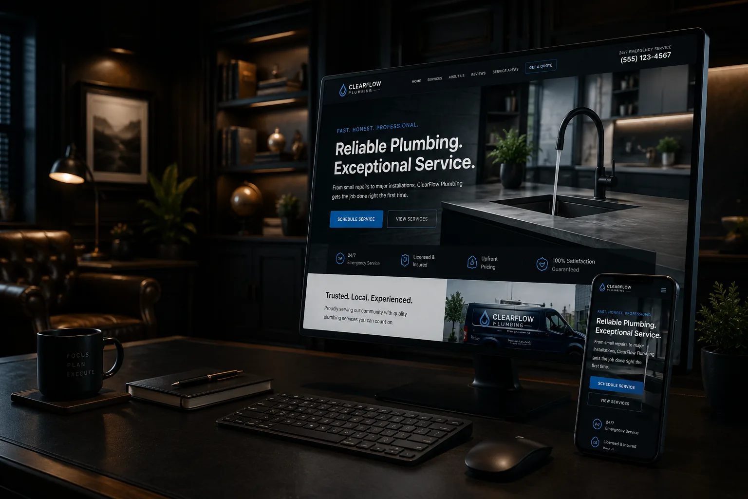
A potential customer lands on your website while standing in a parking lot between jobs. They give the page a quick glance and still can’t tell whether you do residential work, commercial work, or something else entirely.
That happens more often than it should.
The first part of a website—the section people see before they scroll—is sometimes called “above the fold.” The name isn’t important. What matters is whether that first screen helps someone understand your business without making them work for it.
Clarity beats a clever slogan
Many homepages open with a phrase like “Built Around You” or “Quality You Can Trust.” Those lines sound pleasant, but they could belong to a plumber, accountant, landscaper, or furniture store.
A clearer headline would be something like “Residential Plumbing and Heating in the Concord Area.” It isn’t flashy, but the customer immediately knows they’re in the right place.
Under that, one short sentence can explain what makes the company a good fit. Maybe you handle older homes. Maybe you offer emergency service. Maybe your company specializes in commercial properties. This is where a meaningful difference belongs—not a long company history.
Give people an obvious next move
Once visitors understand what you do, they need to know what to do next. For most local businesses, that means calling, requesting an estimate, or scheduling a conversation.
Pick the most important action and make it easy to see. A second option, such as viewing completed projects, can be helpful. Five buttons that all look equally important usually create more hesitation than choice.
This matters even more on a phone. The business name, main service, area, and contact button should not require pinching the screen or digging through a menu.
A little proof goes a long way
The first screen does not need every review, certification, service, and award the company has ever received. One useful trust signal is often enough: licensed and insured status, a relevant certification, years serving the area, or a link to verified reviews.
The image matters too. A real team member, project, vehicle, or recognizable service gives customers useful information. A generic handshake photo mostly tells them that someone found a stock-photo website.
Here’s a simple test: show the homepage to someone who doesn’t work for the company, then take it away after five seconds. Ask what the business does, where it works, and what they would click next.
If they can answer all three, the page is doing its first job. It doesn’t need to tell the whole story yet. It only needs to make the next step feel easy.
Related reading
Your Homepage Does Not Need to Tell Your Whole Story
How Many Calls to Action Should a Small Business Website Have?
Sources
Nielsen Norman Group: How Users Read on the Web
Want a second look at your homepage’s first screen? Request a homepage clarity review from TechDad Technology.